

America-South America-Argentina-Brazil Mercado Free Market Wayfinding System Design
America-South America-Argentina-Brazil Mercado Free Market Wayfinding System Design
1. Color Application and Visual Guidance
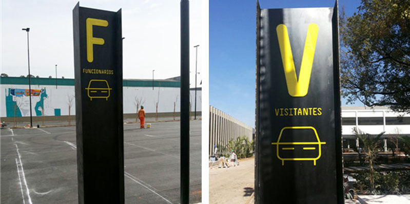
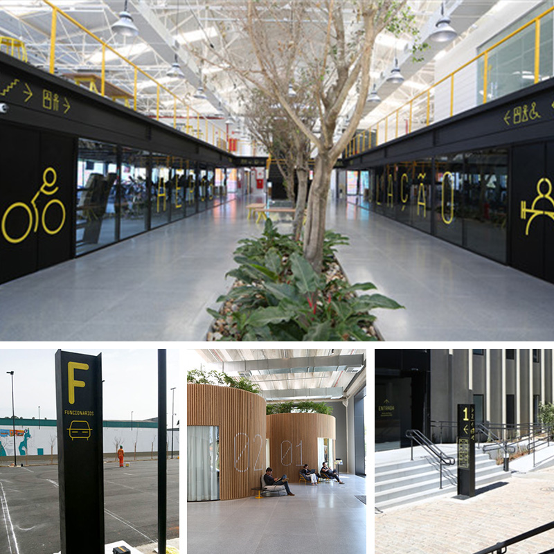
The wayfinding system of Mercado Livre in Brazil uses vivid colors for effective visual guidance. The external vertical signs have a black background
with high - contrast yellow letters. For example, "F" stands for "Funcionarios" and "V" stands for "Visitantes", which are very eye - catching in open areas
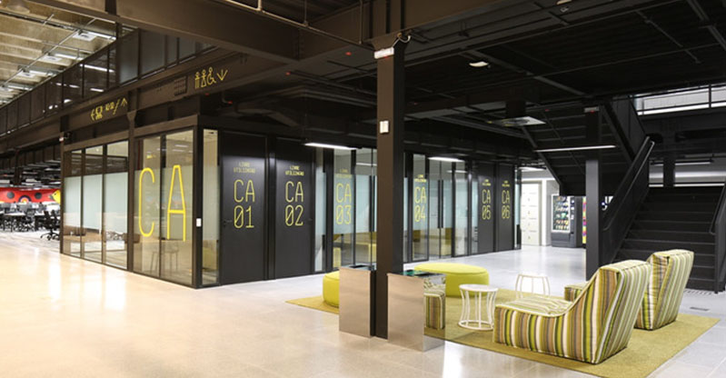
like the parking lot, helping different groups of people quickly find the corresponding parking areas. Inside the market, the yellow lines and signs form
a strong contrast with the black store facades. Signs such as "CA 01" and "CA 02" not only guide customers to specific stores but also add vitality
and recognizability to the space.
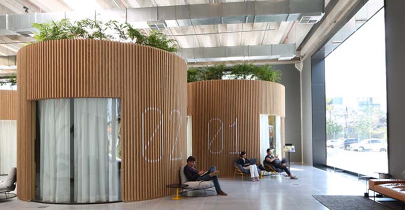
2. Material Selection and Space Integration
In terms of material selection, the wayfinding system focuses on integrating with the overall space of the market. The exterior of the market building
uses modern - style dark materials, and the black columns of the wayfinding signs echo them, with a unified material texture, allowing the signs to
naturally blend into the environment. In some internal areas, circular structures made of wood are used, and the signage design coordinates with them,
adopting simple fonts and lines, which not only highlight the function but also do not disrupt the overall style of the space, creating a comfortable
and harmonious shopping and activity atmosphere.
3. Graphic Symbols and Information Communication
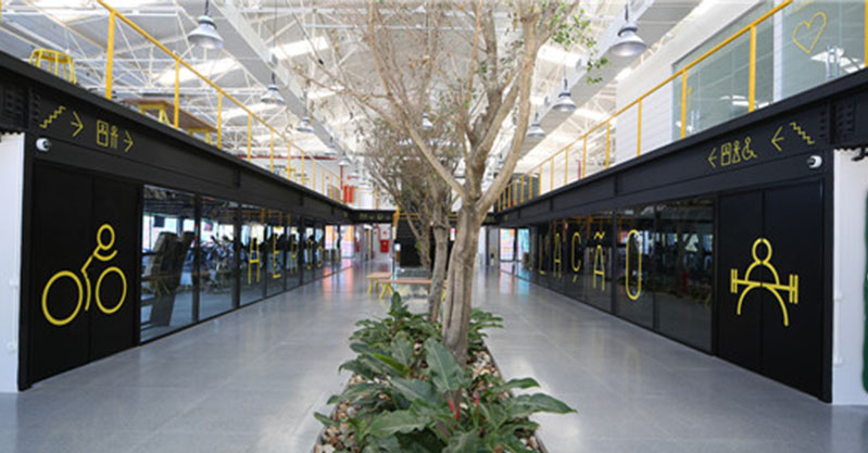
The wayfinding system uses simple and easy - to - understand graphic symbols to assist in information communication. The car graphics on the parking
lot signs clearly indicate the parking function. Graphics such as bicycles and fitness figures on the store facades vividly show the possible business
types of the stores, helping customers quickly understand the store functions without excessive text description, improving the efficiency of information
reception, and is especially convenient for tourists who are not familiar with the local language.
4. Nighttime Wayfinding Effect and Safety
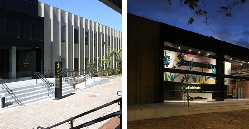
At night, the wayfinding system ensures functionality and safety through lighting design. The signs on the exterior facade of the market building are clearly
visible under the illumination of lights. For example, the "mellicidade" sign is illuminated at night, guiding customers to the market entrance.
The parking lot signs are also clearly visible at night, ensuring that vehicles and people visiting at night can accurately find their positions,
enhancing the recognizability and safety of the market at night.
5. Integrity and Aesthetic Appeal of Design Style
The design style of the wayfinding system has integrity and aesthetic appeal. From the external signs to the internal store signs, a unified design language is adopted,
with color schemes, font styles, and graphic elements echoing each other. Although the decoration styles of different areas inside the market vary, the wayfinding
signs can coordinate with them. For example, in areas with an artistic graffiti style, the signs also incorporate lively elements, not only meeting the functional
requirements but also enhancing the overall aesthetic appeal of the market, bringing a good visual experience to customers.
(This article focuses on case sharing and provides an in-depth analysis of practical experiences for you.)
Case Interpretation Designer:
Myra
Publisher:
Charcy
Recruit:
We will regularly find and share global high-quality sign cases,
if you have a better case or project,
you can send it to us, we will share your case with more people.
 Galaxy COCO Garden
 Global City
 America-South America-Argentin
 Case Analysis of Way finding D