

America-South America-Argentina-Flux IT Company Wayfinding System Design
America-South America-Argentina-Flux IT Company Wayfinding System Design
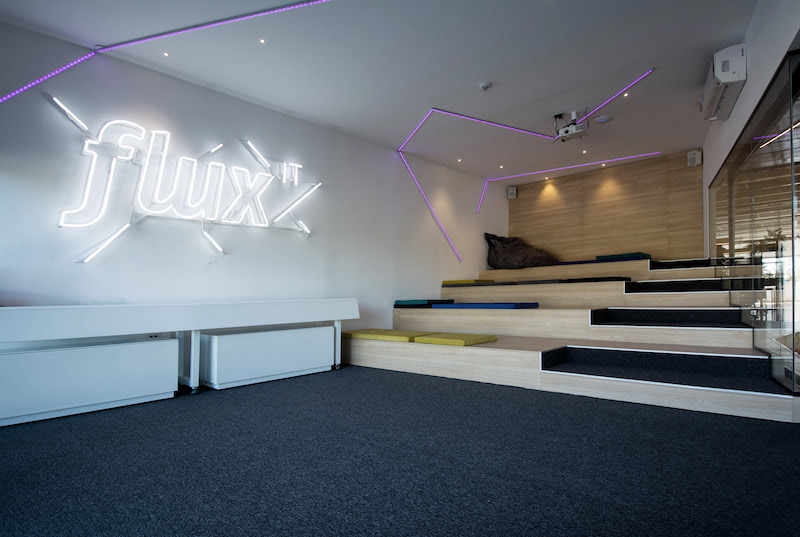
1. Brand Strengthening
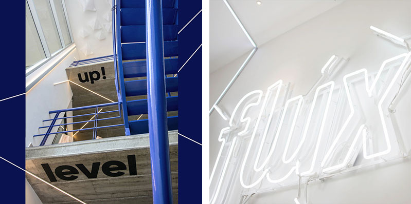
The wayfinding system esign of Flux IT Company attaches great importance to brand strengthening. From the eye - catching "flux IT" logo at the entrance to the
repeated appearance of the brand name throughout the interior, unique fonts and colors are used to enhance brand visual recognition. For example, the "flux IT" logo
in the shape of neon tubes is highly modern and technological, aligning with the positioning of the company as an IT enterprise, enabling employees and visitors to
deeply perceive the brand image.

2. Space Guidance
The wayfinding system performs excellently in space guidance. Through simple and clear signs, such as the indicative words "up!" and "level", combined with arrow
symbols, it clearly guides employees and visitors to move between different floors and areas. For example, the signs beside the stairs clearly indicate the upward
direction, helping people quickly find their way and improving the traffic efficiency within the office space.
3. Color and Material Application
The application of color and materials is a highlight of this wayfinding system. In terms of color, the blue staircase handrails, combined with white walls and wooden
elements, create a fresh and professional atmosphere; the purple lighting lines add a sense of technology and fashion to the space. In terms of materials, wooden
materials bring a warm and natural feeling, while modern materials such as neon tubes and metals highlight the company's innovative and technological attributes.
The combination of various materials enriches the visual hierarchy of the space.
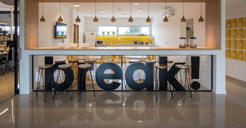
4. Creativity and Fun
A large number of creative and fun elements are integrated into the wayfinding system. For example, the "break!" sign uses large - sized letters, combined with the
scene of the lounge area, vividly conveying the function of the rest area and giving people a relaxed and pleasant feeling; the "TIME - OUT" sign uses a vintage light
bulb shape, adding a unique atmosphere to the space, stimulating the interest of employees and visitors, alleviating the seriousness of the work environment,
and enhancing the affinity of the space.
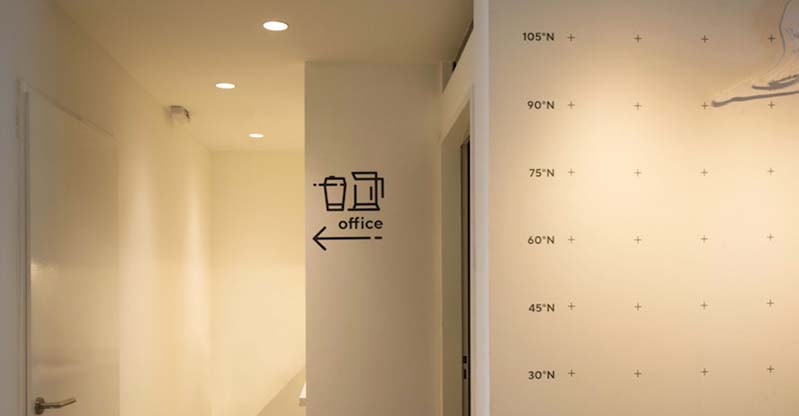
5. Simplicity of Information Communication
The wayfinding system pursues simplicity in information communication. Whether it is the combination of icons and text indicating the location of the office or the
signs for floors and areas, information is presented in the simplest way, avoiding complexity and verbosity. For example, using a simple icon and the word "office"
to indicate the direction of the office allows people to quickly understand and take action, meeting the needs of a fast - paced office environment.
(This article focuses on case sharing and provides an in-depth analysis of practical experiences for you.)
Case Interpretation Designer:
Myra
Publisher:
Charcy
Recruit:
We will regularly find and share global high-quality sign cases,
if you have a better case or project,
you can send it to us, we will share your case with more people.
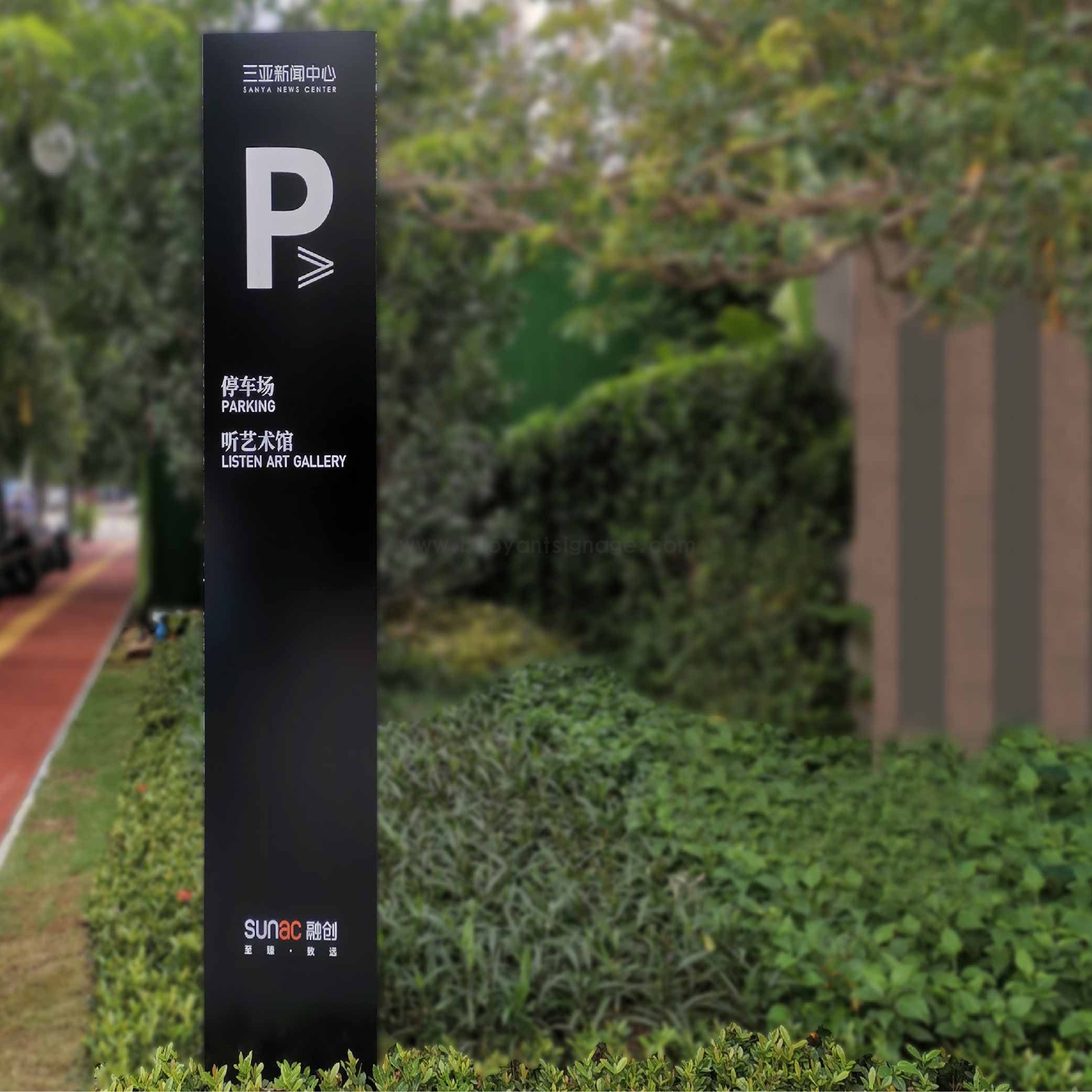 Sanya News Center
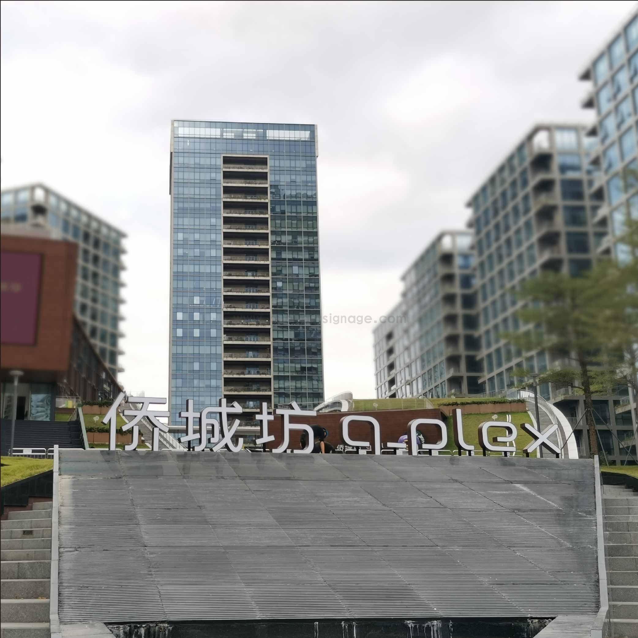 Qiaocheng Square
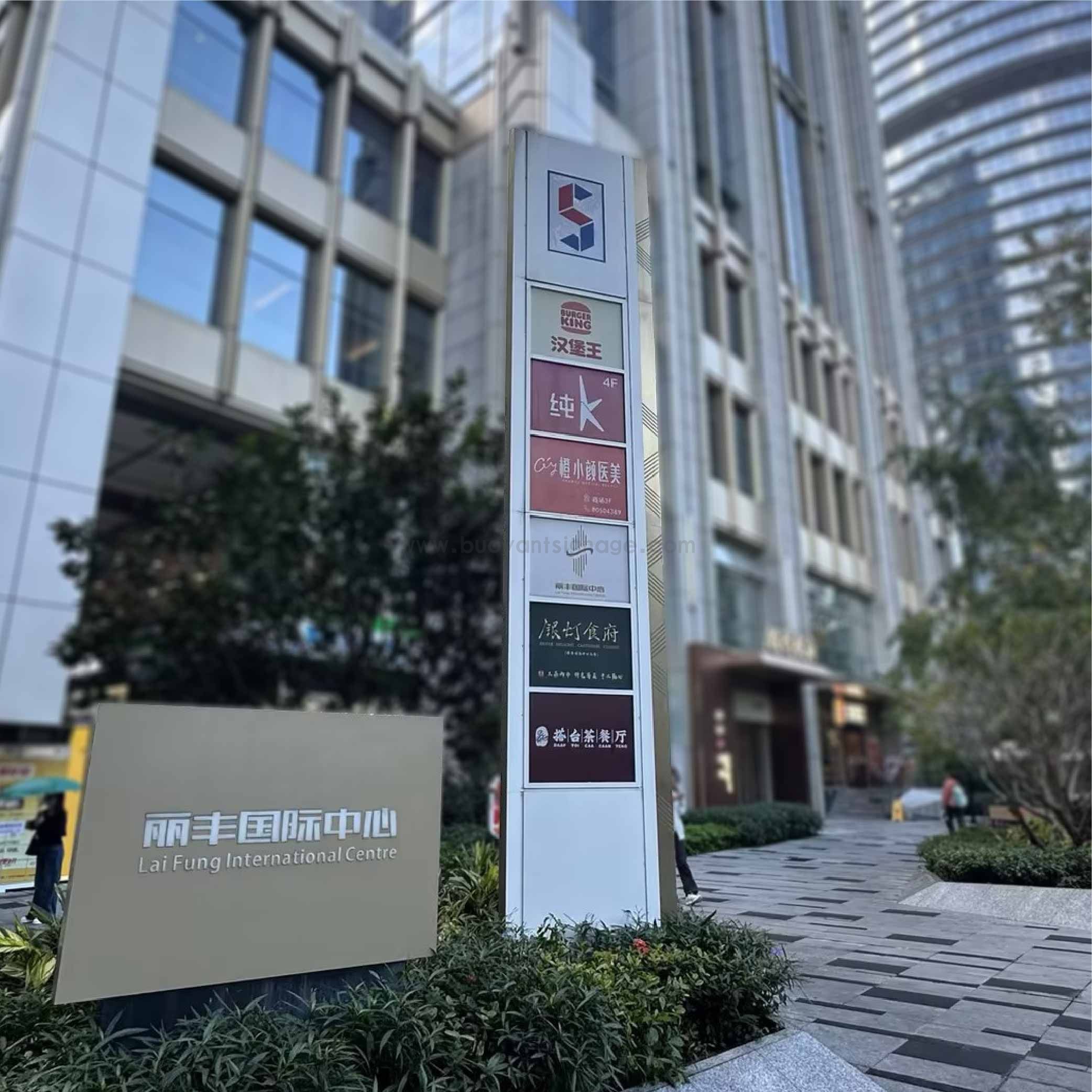 Lifeng International Center
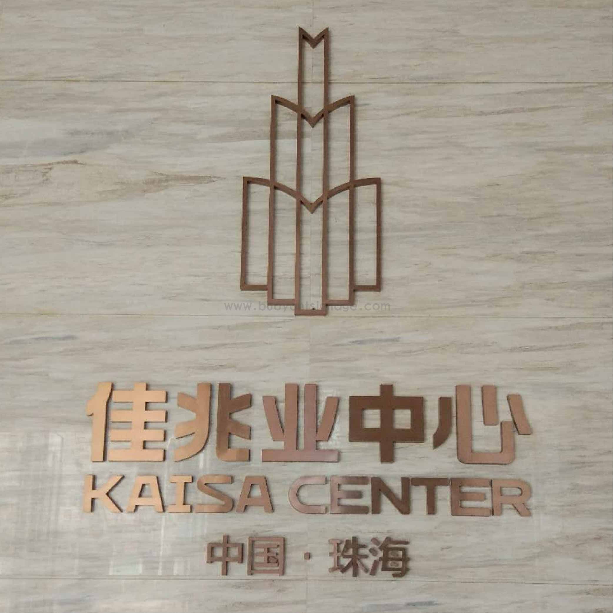 Kaisa Group