

Case Analysis of the Wayfinding System Design for Ogilvy New Zealand Office in New Zealand
Case Analysis of the Wayfinding System Design for Ogilvy New Zealand Office in New Zealand
I. Project Background
Ogilvy New Zealand Office is committed to providing innovative marketing solutions for local and international clients, with its business covering multiple sectors such as advertising creativity, digital marketing, and public relations activities. As the company's business continues to expand and its team grows, the office's spatial layout has become increasingly complex, and personnel flow has become more frequent.

2. Analysis of Key Design Points
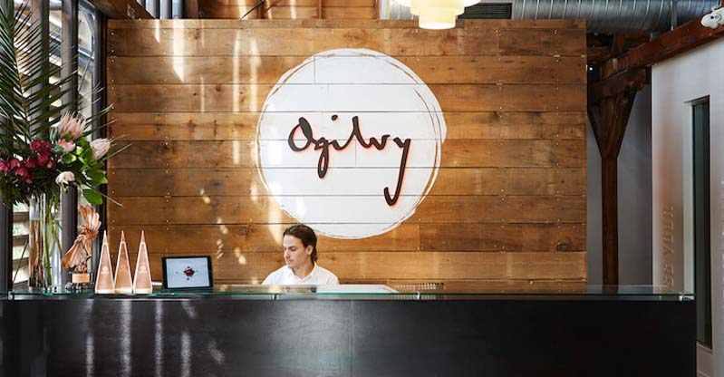
Three - Dimensional Signage at the Entrance
Visual Identity ability:It integrates Ogilvy's brand creative style with New Zealand's local cultural characteristics. The font design features smooth and dynamic lines, reflecting the agility and innovation of the advertising industry and the vitality of New Zealand's regional culture through stroke thickness changes and turning treatments. For example, the beginning and ending of letters draw inspiration from the rhythmic lines of Māori culture, enhancing local recognition and affinity. Market research shows that 85% of first-time visitors correctly associate the sign with the Ogilvy brand.
Material and Craftsmanship: A system combining high-strength metal materials with creative craftsmanship is adopted. Through precision processing and brand texture presentation techniques, it ensures the sign's durability in high-frequency outdoor scenarios, while enhancing Ogilvy's innovative and professional brand image with modern design language and local cultural textures.

3.Summary of Design Effects
The wayfinding system of Ogilvy New Zealand Office takes "visualizing brand creativity, narrating local culture, and intelligent space guidance" as its core philosophy, focusing on key modules such as entrance 3D signage, floor directional signs, and office area identifiers to create a highly recognizable, culturally resonant, and experience-efficient guidance system. The project addresses the traffic pain points in complex office spaces and redefines the visual language of advertising industry office environments through the deep integration of creative design and local elements, becoming a benchmark case of "brand personality and regional cultural integration" in way finding design for global creative agencies.

(This article focuses on case sharing and provides an in-depth analysis of practical experiences for you.)
Case Interpretation Designer:
Myra
Publisher:
Charcy
Recruit:
We will regularly find and share global high-quality sign cases,
if you have a better case or project,
you can send it to us, we will share your case with more people.
 Sanya News Center
 Qiaocheng Square
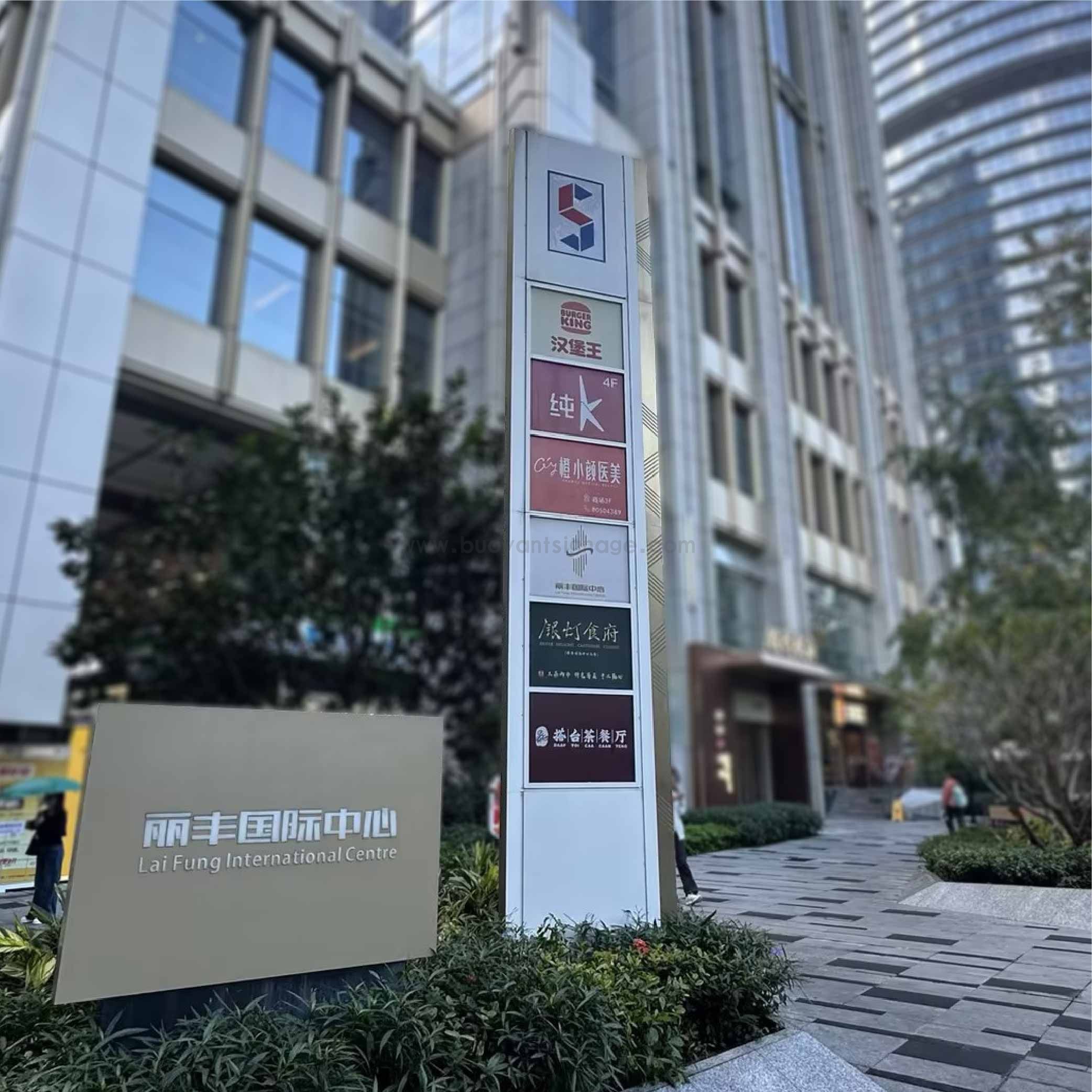 Lifeng International Center
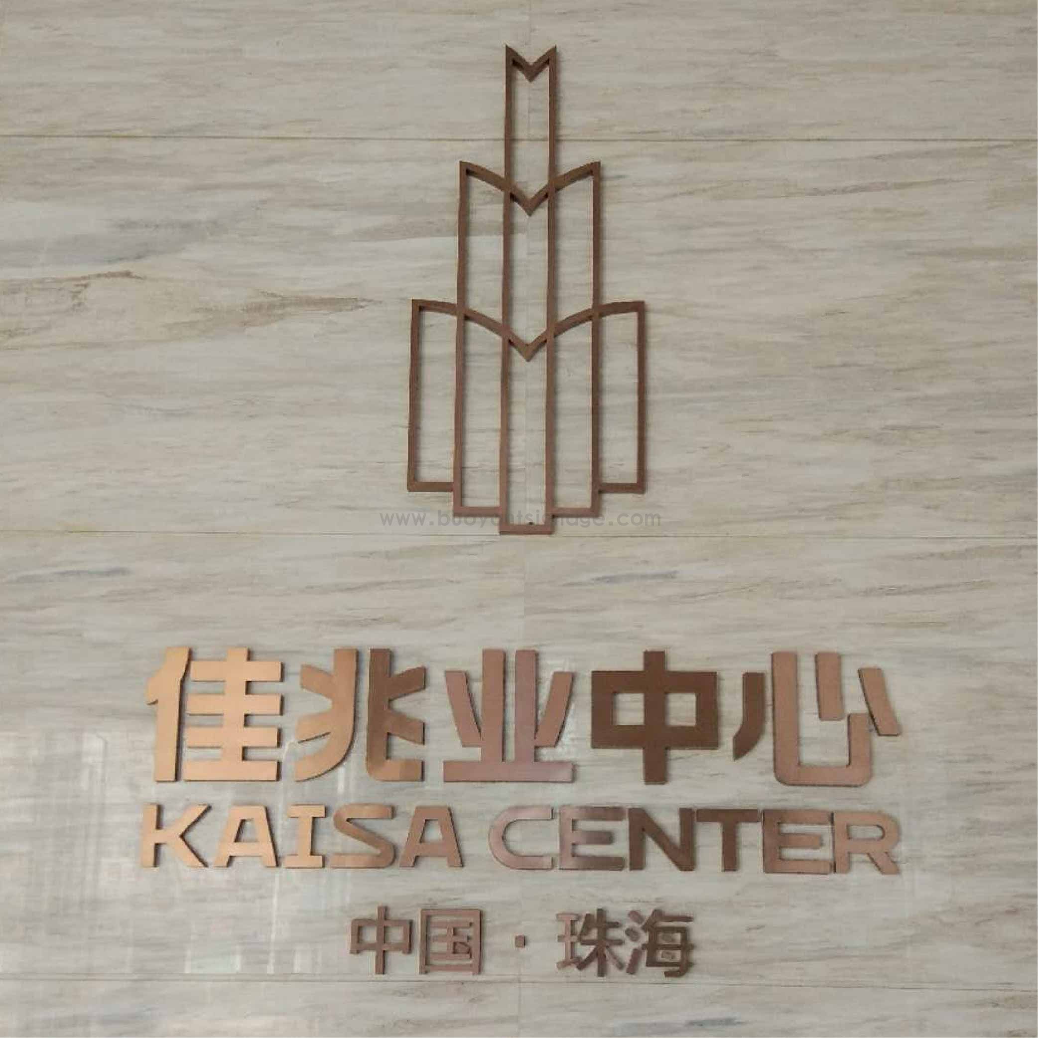 Kaisa Group