

Oceania-Australia-IAG Group Headquarters Signage and Guidance System Design
Oceania-Australia-IAG Group Headquarters Signage and Guidance System Design
As a leading insurance institution in Australia, the Insurance Australia Group (IAG) aimed to upgrade its headquarters office space to create an efficient, modern environment with high brand recognition. The signage and way finding system is not only required to fulfill the basic function of space guidance but also to strengthen the brand image and enhance the experience of employees and visitors.

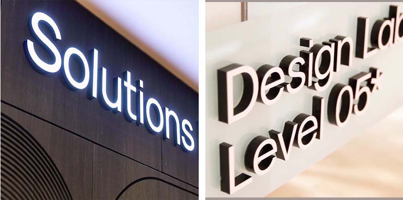
Brand Enhancement: The 3D signage letters adopt the brand's signature purple color, which is eye - catching and highly recognizable. The font design is modern and simple, in line with the IAG brand image. They are installed at the entrance and key areas of the headquarters, visually conveying brand information at first glance.
Material and Craftsmanship: Metal materials are selected and the surface is finely processed to ensure a high - quality texture under different lighting conditions. Meanwhile, they are durable enough to withstand daily environmental erosion. The edges of the 3D letters are polished smoothly, and the lighting effect is uniform, enabling the brand logo to be clearly displayed at night.
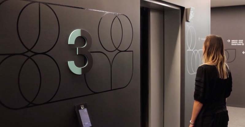
Clarity of Information: The floor signage uses a combination of simple and clear graphics and text. Information such as the functional areas on different floors and the distribution of offices is presented in an easy - to - understand way. The numbers on the signage are in large sizes and uniquely designed. For example, the number "3" on the 3rd - floor signage adopts a scientific and technological - style shape and color scheme, which stands out against the dark - colored wall for quick identification.
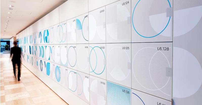
Style Consistency: The design elements of the floor signage echo the overall space style, integrating geometric graphic elements such as circles from the brand's visual language. The color system also coordinates with the main color of the space. From materials to colors, it maintains style consistency with the surrounding environment and 3D signage letters, enhancing the overall sense of the space.

(This article focuses on case sharing and provides an in-depth analysis of practical experiences for you.)
Case Interpretation Designer:
Myra
Publisher:
Charcy
Recruit:
We will regularly find and share global high-quality sign cases,
if you have a better case or project,
you can send it to us, we will share your case with more people.
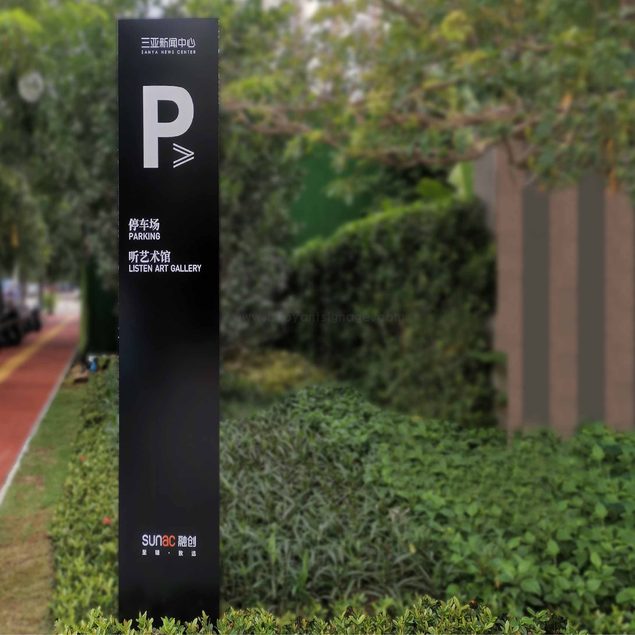 Sanya News Center
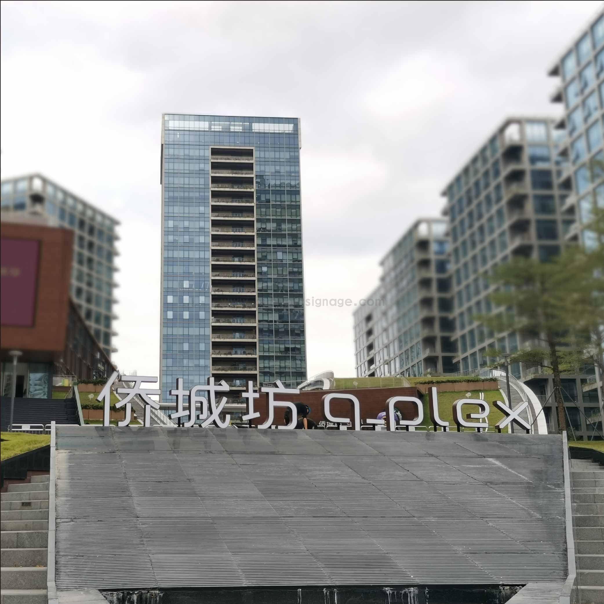 Qiaocheng Square
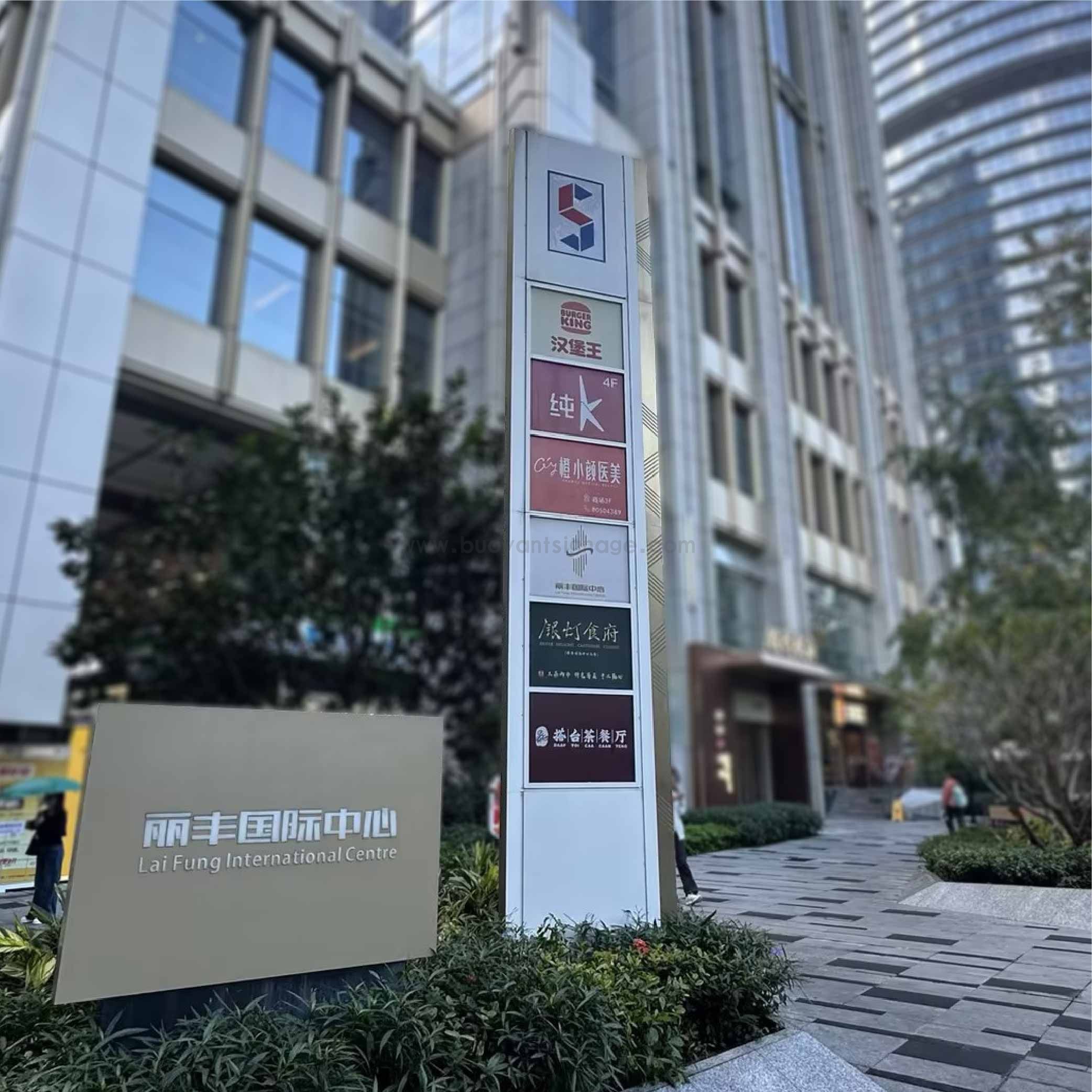 Lifeng International Center
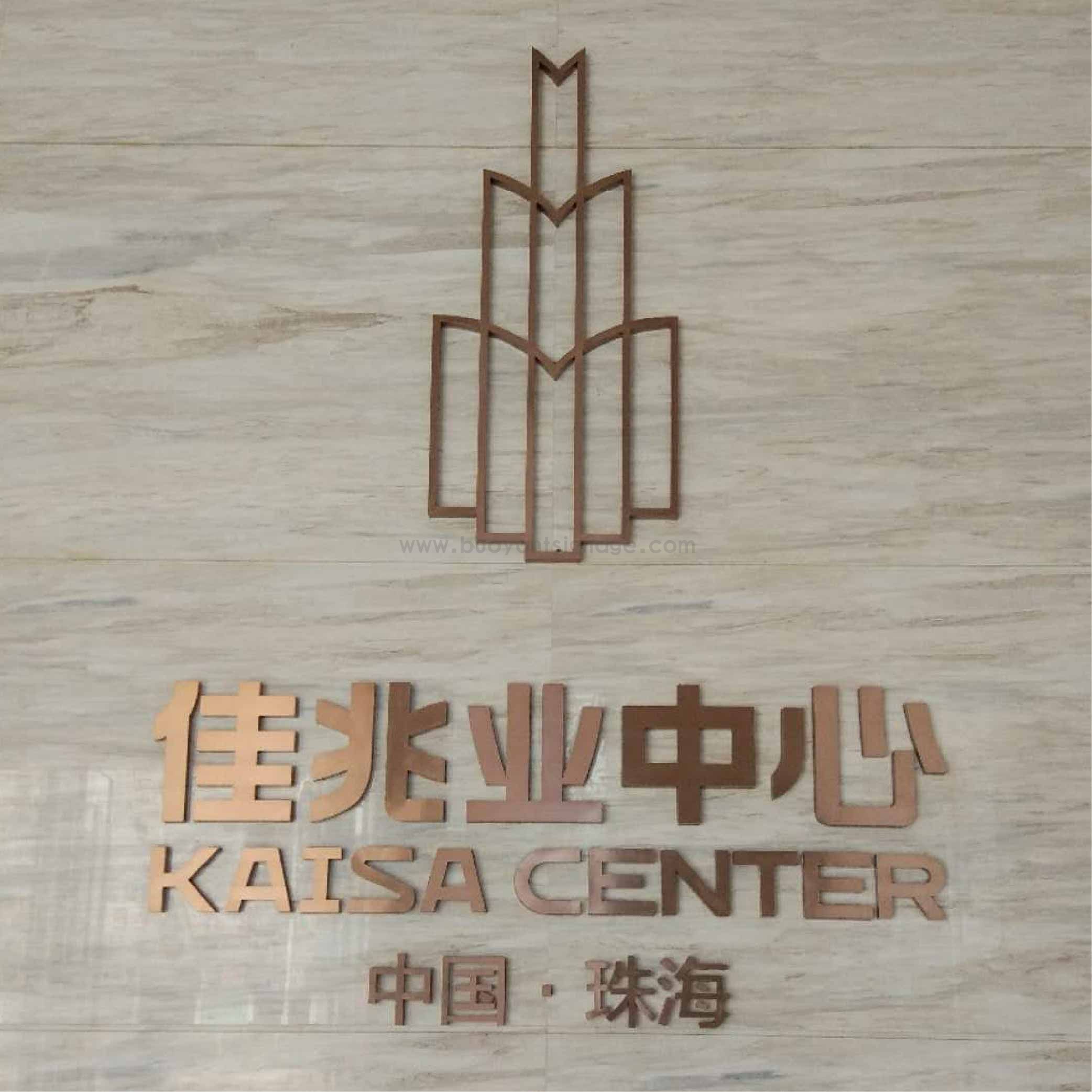 Kaisa Group