

Americas - North America - Canada - 10th Avenue Health Care District Wayfinding System Design
Americas - North America - Canada - 10th Avenue Health Care District Wayfinding System Design
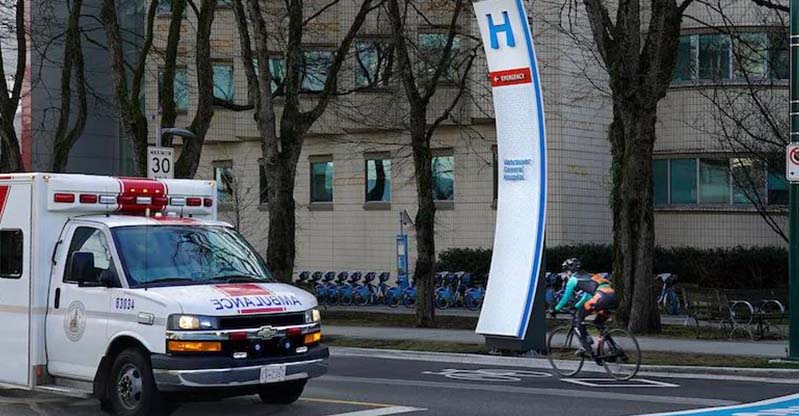
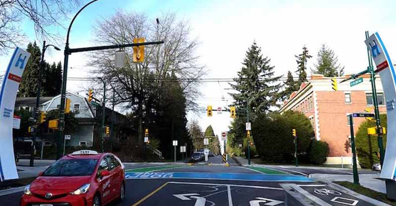
1. Eye-catching entrance sign
The entrance sign is very eye-catching. The large-scale, curved structure with blue and white tones and a bold "H" immediately conveys the identity of the wellness
area, creating a strong first impression identity.
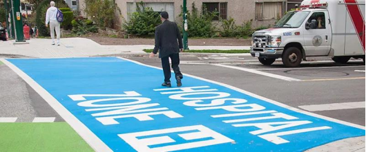
2. Clear ground markings
The ground markings are clear. The blue - colored "HOSPITAL ZONE" text on the road surface clearly defines the hospital area, which is intuitive for both drivers
and pedestrians, enhancing safety and navigational clarity.
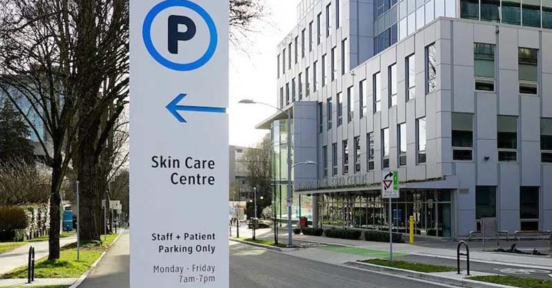
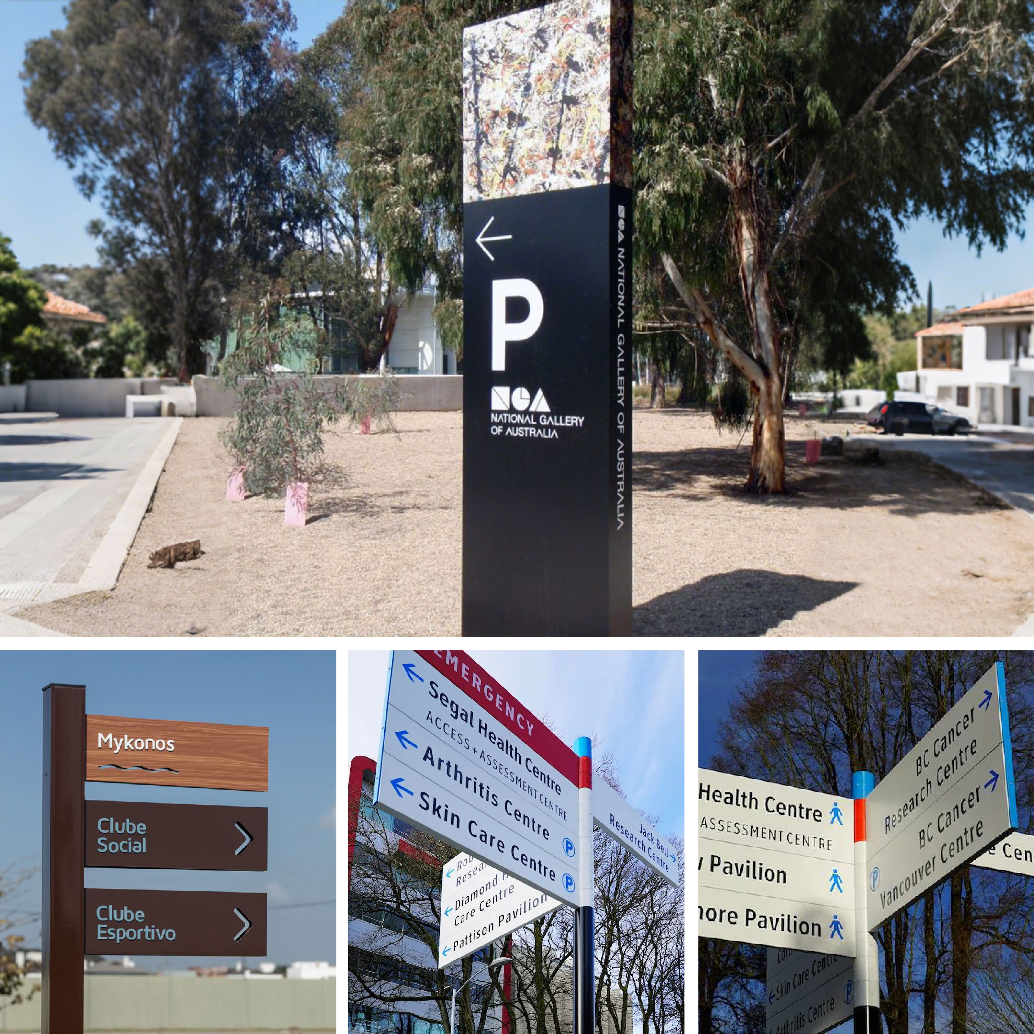
3. Color differentiation function
Colors distinguish functions. For example, the red - colored "EMERGENCY" sign stands out prominently, quickly guiding people to emergency areas;
blue is used for general directions and parking signs (like the "P" symbol), establishing a clear visual hierarchy.
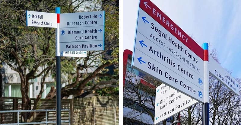
4. Intuitive combination of icons and text
The combination of intuitive icons and text. Icons such as the pedestrian symbol and parking "P" are integrated with text (e.g., "Jack Bell Research Centre",
"Diamond Health Care Centre"), making information dissemination more straightforward, even for those with limited language understanding.
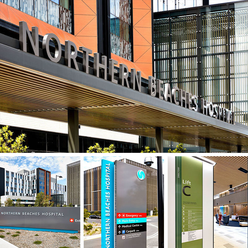
5. Unified design style
The design style is unified. From the entrance arc - shaped sign to each directional sign, consistent color schemes, font styles, and structural forms are maintained,
strengthening the overall brand image and creating a cohesive visual experience.
6. Multi-level guide layout
The layout provides multi - level wayfinding. Combining ground markings with vertical signs ensures that information can be captured from various angles and distances,
catering to different users such as pedestrians, drivers, and emergency vehicles.
This wayfinding system for the 10th Avenue Health Care Area in Canada effectively combines functionality and aesthetics through color coding,
intuitive iconography, and unified design, enhancing the overall experience of the health - care environment and providing efficient guidance for patients,
visitors, and staff.
(This article focuses on case sharing and provides an in-depth analysis of practical experiences for you.)
Case Interpretation Designer:
Myra
Publisher:
Charcy
Recruit:
We will regularly find and share global high-quality sign cases,
if you have a better case or project,
you can send it to us, we will share your case with more people.
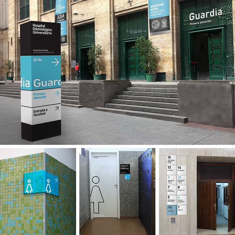 America-South America-Argentin
 Americas - North America - Can
 Case Analysis of the Way findi
 Case Analysis of the Wayfindin