

America-South America-Argentina-UBA Dental Hospital Wayfinding System Design
America-South America-Argentina-UBA Dental Hospital Wayfinding System Design
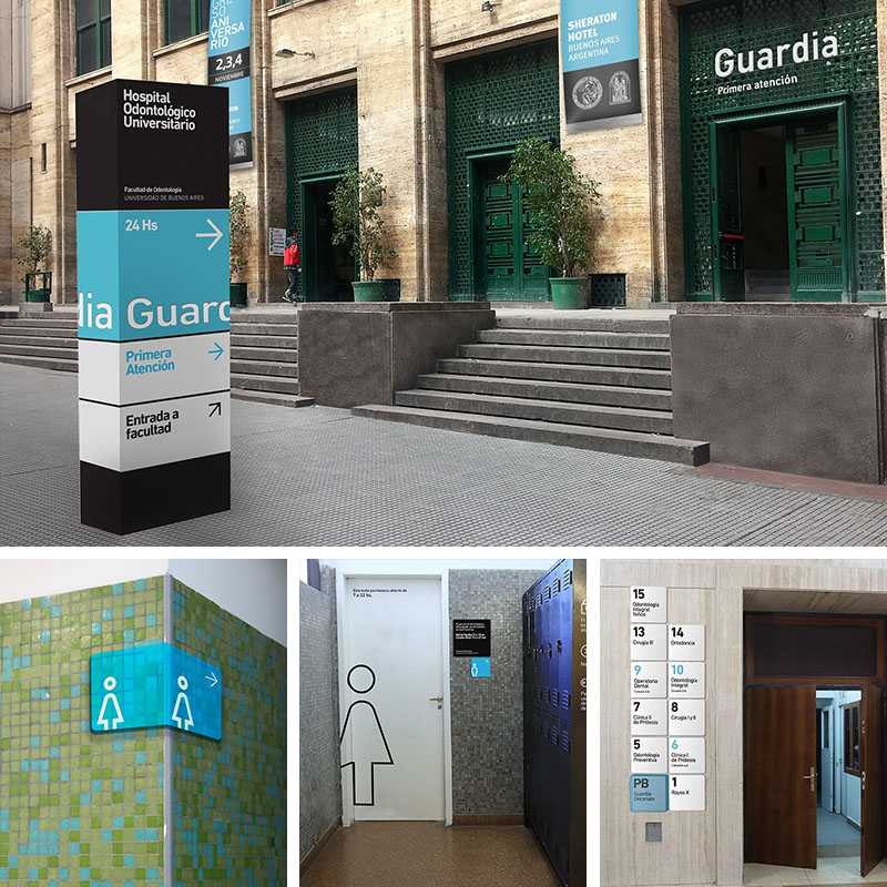
1. Color and Material Matching
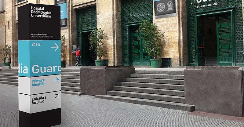
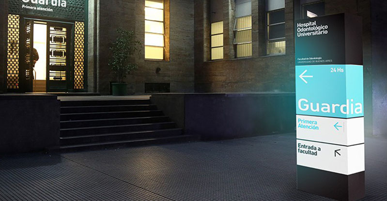
The wayfinding system of UBA Dental Hospital skillfully uses colors and materials. The external vertical signs mainly feature black, white, and blue, which are simple
and eye - catching. Black is calmness,white is pure, and blue brings a sense of professionalism. The internal signs are integrated with the building materials.
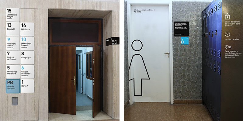
For example, simple black and white signs are used on marble walls, highlighting the information without compromising the overall aesthetic of the space.
2. Clear Information Communication
The wayfinding system performs excellently in information communication. Floor index signs use large fonts and clear numbers, such as "5", "6", "7", etc., combined
with department names like "Odontología Preventiva" and "Clínica I de Prótesis", enabling patients to quickly find the target departments. The electronic display
screen in the waiting area shows real - time consultation information, such as "Siguiente turno A25", facilitating patients to understand the consultation progress.
3. Functional Zone Guidance
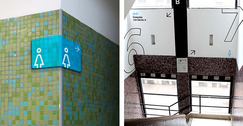
The wayfinding system provides clear guidance for functional zones. From the indications of "Guardia" and "Primera Atención" at the entrance, to the signs for internal
areas such as "Intendencia" and "Aula Magna Pullman", and then to the indications of facilities like restrooms and lockers, all use clear text and arrows to help patients
and visitors move smoothly within the hospital, improving the space utilization efficiency.
4. Consistency of Design Style
The overall design style is consistent. Whether it is external signs or internal signs, a simple and modern design language is adopted, with a unified font and a coordinated color scheme. For example, the restroom signs are presented with simple graphics and a blue - and - white color scheme, which is consistent with the style of the entire wayfinding system, giving a professional and orderly visual impression.
(This article focuses on case sharing and provides an in-depth analysis of practical experiences for you.)
Case Interpretation Designer:
Myra
Publisher:
Charcy
Recruit:
We will regularly find and share global high-quality sign cases,
if you have a better case or project,
you can send it to us, we will share your case with more people.
 America-South America-Argentin
 Americas - North America - Can
 Case Analysis of the Way findi
 Case Analysis of the Wayfindin